UX/UI CASE STUDY
Forex Mobile App Redesign
Integrating new currency card service while maintaining converter accessibility through smart UX solutions
CLIENT
Forex Bank
ROLE
UX/UI Designer
TIMELINE
2025 (Internship)
TOOLS
Figma, Figjam, Kanban
About

Forex Bank is a leading Nordic financial services company specializing in currency exchange and international payments. With a strong presence across Scandinavia, they serve both private customers and businesses with currency solutions, travel money, and payment services.
As part of their digital transformation, Forex Bank launched a new currency card service that needed to become the centerpiece of their mobile app experience. The challenge was integrating this new service while maintaining easy access to their popular currency converter tool.
The Needs
Before the redesign, Forex faced a critical challenge: how to introduce their new currency card service as the primary feature while preserving the accessibility of their popular currency converter that existing users relied on daily.
A crucial aspect was that the converter needed to remain accessible without login, while the currency card required authentication.
Challenge
Forex needed to integrate their new currency card service as the main feature, but the popular currency converter was taking up prime screen space.
- •Previous design didn't meet expectations
- •Converter was essential for existing users
- •New card service needed prominence
The Solution
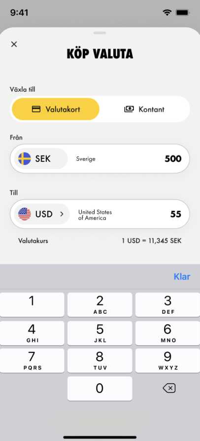
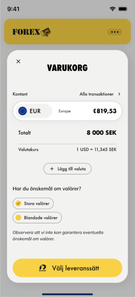
Moved the currency converter to a dropdown overlay, keeping it one swipe away while freeing space for the currency card.
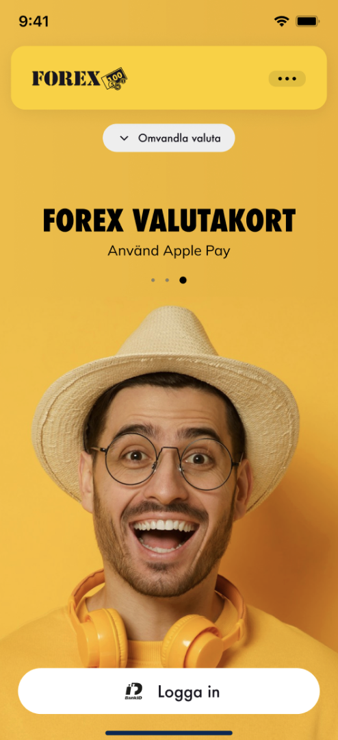
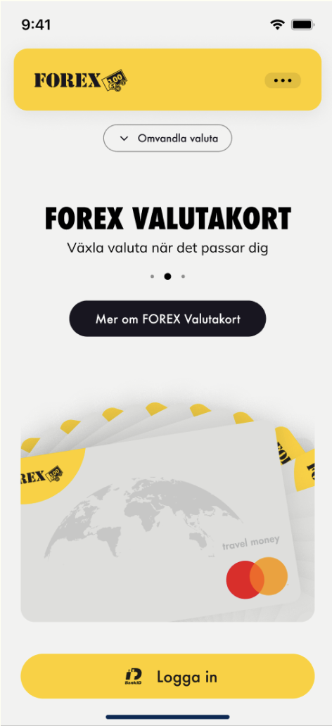
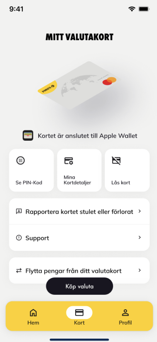
Currency Card Prominently Featured
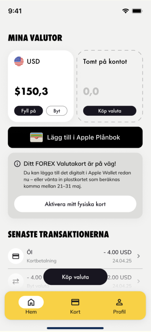
The new currency card service takes center stage on the start screen with clear visuals and call-to-action buttons for logged-in users.
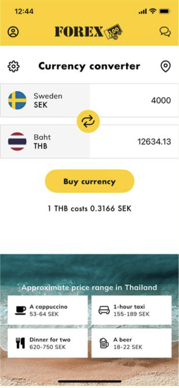
Converter Accessible Without Login
Users can access the converter with a single tap from the top navigation, maintaining the quick, login-free access they're accustomed to – preserving a critical user behavior.
Clear Visual Hierarchy
The redesigned interface establishes a clear information hierarchy that guides users naturally through the app, whether logged in or not.
Before & After
Before
After
- •Converter takes prominent space
- •No clear path to currency card
- •Cluttered interface with competing elements
- ✓Currency card prominently featured
- ✓Converter accessible via dropdown – no login required
- ✓Two start screens for different user needs
- ✓Clean, focused user experience
Measurable Results
The redesign successfully achieved its goals by creating a solution that balanced business priorities with user needs, resulting in improved engagement and satisfaction.
Compromise solution
Converter accessibility
Homepage concepts delivered
Key Achievement
Successfully balanced competing priorities by creating a solution that gave prominence to the new currency card service while maintaining the accessibility of the popular currency converter – crucially preserving login-free access for existing users. Solving the core business challenge through smart UX reorganization.
Visual Design Solutions
Reflection
"This project taught me the importance of balancing new functionality with existing user habits. Designing a new service while simplifying access to an established one required careful consideration of user flow and clarity."
— Personal reflection on the project